
Quick answer: a call to action (CTA) works when it is clear, specific and low-risk. Write button text that describes what the visitor gets ("Get my free quote", "Book a 20-minute call"), give each page one primary action, make the button stand out with contrast and size, place it where the decision happens, and add a short line next to it that removes doubt ("No obligation, reply within one working day"). Then test the wording, not just the color.
Why CTAs underperform
Most weak calls to action fail for the same reasons: the visitor does not know what will happen when they click, the action feels like too big a commitment or there are so many options that nothing stands out.
"Submit", "Learn more" and "Click here" describe the mechanics of the button, not the value of clicking. Visitors hesitate, and hesitation on the web usually means leaving.
10 best practices
1. Describe the outcome, not the action
The button should finish the sentence "I want to...". Compare:
| Weak | Stronger |
|---|---|
| Submit | Get my free quote |
| Learn more | See how it works |
| Sign up | Start my free trial |
| Contact us | Book a 20-minute call |
| Download | Get the checklist |
First-person wording ("my") sometimes performs better than second person ("your"), but not always. It is worth testing on your own site.
2. One primary action per page
Each page should have one main thing you want visitors to do. Other actions can exist, but as secondary links or outlined buttons. When two equally loud buttons compete, visitors often choose neither.
3. Match the CTA to the visitor's stage
A first-time visitor reading a blog post is rarely ready to "Buy now". Offer a step that fits: a checklist, a free audit, a short video or a free consultation. A visitor on a service page comparing options is ready for "Get a quote" or "Book a call".
4. Lower the commitment
Small words change how risky a click feels. "Free", "no obligation", "takes 2 minutes" and "cancel anytime" all lower the barrier, as long as they are true. If the next step is a long form, say so honestly and explain why.
5. Put reassurance right next to the button
The line directly under or beside the button is one of the most valuable spots on the page. Use it to answer the last doubt: response time, privacy, what happens next or a short review.
6. Make it look like a button
Use a solid color that contrasts with the background and is used for nothing else on the page. Give it enough padding, a clear label and rounded or square corners that look tappable. Text links that pretend to be buttons get fewer clicks.
7. Size it for thumbs
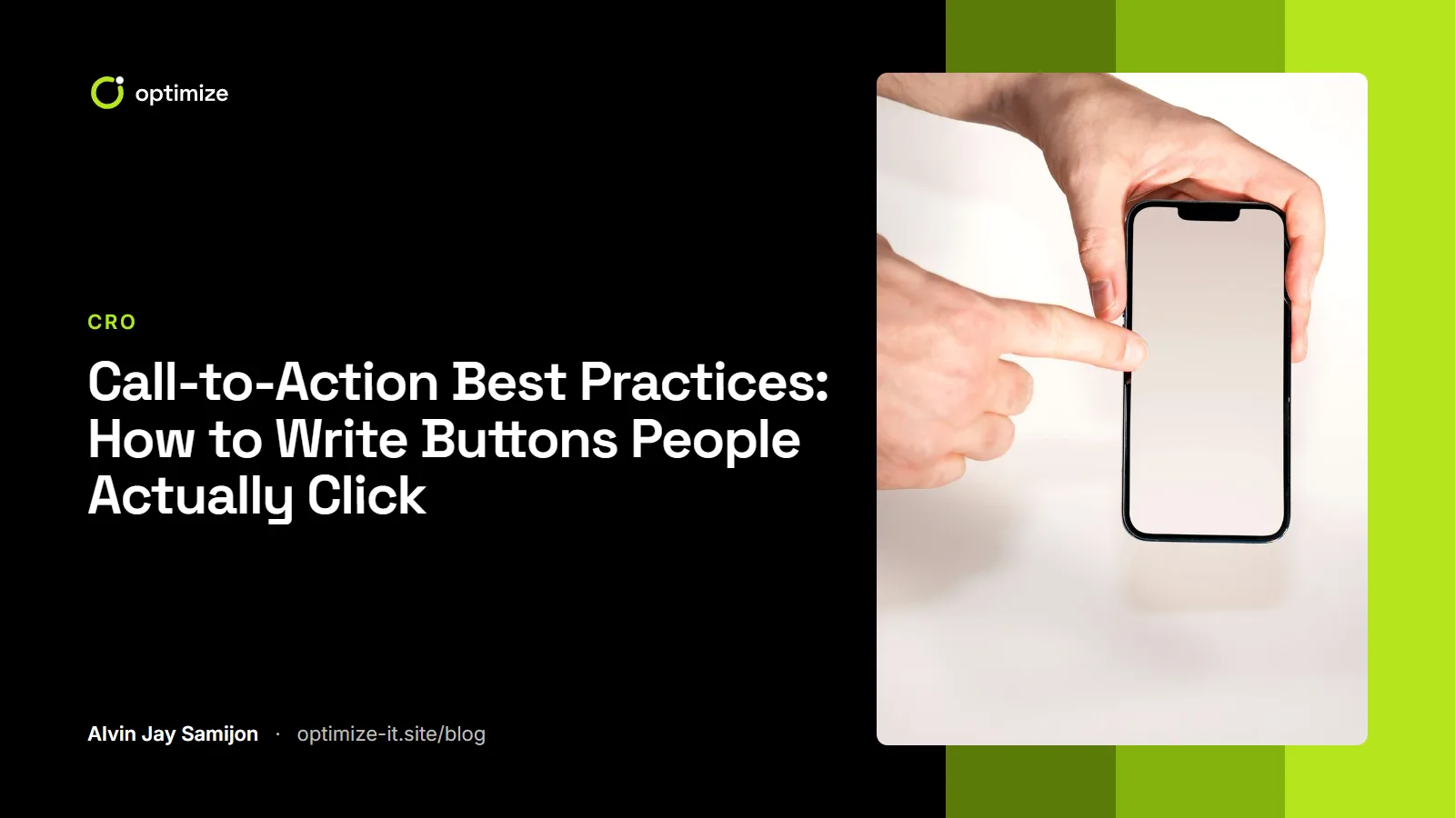
On phones, make buttons at least 44 by 44 pixels, with space around them so visitors do not tap the wrong one. Full-width buttons work well on small screens, and a tap-to-call button often beats a form for urgent services.
8. Place it where the decision happens
Put the primary CTA at the top of the page for visitors who are ready, and repeat it after the sections that answer key questions: after the benefits, after the proof and at the end. On long pages, a sticky button on mobile can help, if it does not cover content.
9. Keep the promise on the next page
If the button says "Get my free quote", the next page should be a short quote form, not a general contact page. A mismatch between the click and what follows is one of the quickest ways to lose people. The same principle applies to your contact forms.
10. Make it accessible
Button text should make sense on its own for screen reader users, so avoid five buttons that all say "Learn more". Keep color contrast at least 4.5:1 for the text, and make sure the button works with a keyboard.
Where CTAs go on a typical page
| Section | CTA |
|---|---|
| Hero | Primary CTA plus reassurance line |
| After benefits | Repeat the primary CTA |
| After proof (reviews, case studies) | Primary CTA |
| After FAQs | Primary CTA or a softer option |
| Footer | Contact details and the primary CTA |
How to test CTA changes
Start with the wording, then placement, then design. Color changes alone rarely make a lasting difference unless the button was hard to see in the first place.
With enough traffic, run an A/B test on one change at a time. With low traffic, compare click-through and conversion for a few weeks before and after the change, and watch session recordings to see whether visitors notice and use the button. Strong wording only helps if the offer behind it is clear, so start with your value proposition.
Common mistakes
- Using "Submit" or "Send" on forms that ask for a lot of personal details
- Several primary buttons with the same visual weight
- CTAs that only appear at the very bottom of long pages
- Buttons that look disabled because of low contrast
- Promising "free" when the next step turns out to be a sales call
Frequently asked questions
What is the best color for a CTA button?
There is no single best color. The best button color contrasts strongly with the rest of the page and is not used for other elements, so it stands out.
How many CTAs should a page have?
One primary action, repeated where it makes sense, plus optional secondary actions. Long pages may show the same primary CTA three or four times.
Should CTA text be in first person?
Sometimes "Get my quote" outperforms "Get your quote", but results vary. Test it on your own audience if you have the traffic.
Does adding urgency help?
Real deadlines, such as a limited-time offer or a booking cutoff, can help. Fake urgency usually damages trust and conversions over time.
Want your calls to action and the pages around them reviewed? Our landing pages and funnels service covers copy, layout and testing, or you can start with a free audit.